library(kableExtra)Chapter 1: Data and Descriptive Statistics
Statistics is the science (and to a degree, art) of collecting, analyzing, interpreting, presenting, and organizing data. Data are the raw facts and figures collected.
Data are usually organized in a table with rows representing individuals (called observations) and columns representing characteristics (called variables).
Here are some examples of variables, categorized for clarity:
Quantitative (or Numerical) variables:
Discrete: variables that can only take on specific values (often whole numbers). Examples:
- The number of cars in a parking lot.
- The number of students in a class.
- The number of defects in a batch of manufactured goods.
- The count of how many times a word appears in a text.
Continuous: variables that can take on any value within a given range. Examples:
- Height of students.
- Weight of apples.
- Temperature in a room.
- Time taken to complete a task.
- Stock prices.
Qualitative (or Categorical) variables:
Nominal: variables that represents categories with no inherent order. Examples:
Eye color (blue, brown, green).
Gender (male, female, other).
Type of car (sedan, SUV, truck).
Country of origin.
Ordinal: variables that represents categories with a meaningful order. Examples:
- Education level (high school, bachelor’s, master’s, PhD).
- Customer satisfaction (very satisfied, satisfied, neutral, dissatisfied, very dissatisfied).
- Ranking of athletes in a competition.
Data Examples in context:
- A survey: Data could include age (quantitative, continuous), gender (qualitative, nominal), income (quantitative, continuous), and level of satisfaction with a product (qualitative, ordinal).
- A medical study: Data might include blood pressure (quantitative, continuous), weight (quantitative, continuous), presence or absence of a disease (qualitative, nominal), and severity of symptoms (qualitative, ordinal).
- A sales report: Data would include sales figures (quantitative, discrete or continuous depending on how sales are recorded), product type (qualitative, nominal), and region (qualitative, nominal).
- A website analytics report: Data include the number of page views (quantitative, discrete), average session duration (quantitative, continuous), geographic location of visitors (qualitative, nominal), and bounce rate (quantitative, continuous).
1.1 What Are Descriptive Statistics?
Descriptive statistics are numerical measures and visualizations that summarize a dataset’s key characteristics. The main categories of numerical measures include:
- Central Tendency: Where the data tends to cluster (e.g., mean, median, mode).
- Dispersion: How spread out the data is (e.g., range, variance, standard deviation, IQR).
These metrics provide a snapshot of the data, useful for initial analysis and reporting.
1.1.1 Measures of Central Tendency
The mean (average) is the sum of all values divided by the number of observations.
The median is the middle value when data is ordered. It’s less sensitive to outliers than the mean. Outliers are observations that are extremely large or small relative to other observations.
The mode is the most frequent value in data.
1.1.2 Measures of Dispersion
The range is the difference between the maximum and minimum values of data.
The Variance measures the average of squared deviations of individual observations from the mean.
The standard deviation (SD) is the square root of variance, representing typical deviation from the mean.
The Interquartile Range (IQR) is the distance between the first quartile (\(Q1\), 25th percentile) and third quartile (\(Q3\), 75th percentile), capturing the middle 50% of the data. Both \(Q1\) and \(Q3\) are special percentiles. A percentile is a value below which a certain percentage of observations in a group of observations falls. For example, the 25th percentile (i.e., \(Q1\)) is the value below which 25% of the data falls, the 75th percentile (i.e., \(Q3\)) is the value below which 75% of the data falls, and the median is the 50th percentile. Percentiles of data can be found using R software (Section 1.3).
1.1.3 Plots for Visualizing the Distribution of Data
- Visualization of data distribution:
- for numerical data: histogram, boxplot, density curve
- for categorical data: barplot
1.1.3.1 How to Create a Histogram
Your data must be numeric.
Divide your data for a variable into k (k = 5 ~ 25) bins of the same length.
Determine frequencies (number of data points falling into each bin).
Draw the Histogram:
Draw the x-axis: Label the x-axis with the bin boundaries (such as 72-76, 77-81, etc.).
Draw the y-axis: Label the y-axis with frequencies.
Draw the bars: Above each bin on the x-axis, draw a bar whose height corresponds to the frequency of that bin.
Add appropriate title to the plot.
How can we examine a histogram?
- If the histogram has a long tail extending to the right, it’s said to be right-skewed (or positively skewed).
- If the histogram has a long tail extending to the left, it’s said to be left-skewed (or negatively skewed).
- If there is an axis of symmetry, it’s said to be symmetric.
- If a histogram has only one peak, it’s said to be unimodal.
- If a histogram has two peaks, it’s said to be bimodal.
We will use R software to make histograms.
1.1.3.2 How to Create a Boxplot
You data must be numeric.
A box plot (also known as a box-and-whisker plot) is a standardized way of displaying the distribution of a dataset based on five key summary statistics:
- Minimum: The smallest value in the dataset.
- First Quartile (Q1): The 25th percentile; 25% of the data falls below this value.
- Median (Q2): The 50th percentile; the middle value of the dataset when sorted.
- Third Quartile (Q3): The 75th percentile; 75% of the data falls below this value.
- Maximum: The largest value in the dataset.
A box plot is a visual representation of these five statistics:
- Box: The box itself spans from Q1 to Q3, representing the interquartile range (IQR). The median (Q2) is shown as a line inside the box.
- Whiskers: The lines extending from the box (the “whiskers”) typically reach to the minimum and maximum values, but there are variations (explained below).
- Outliers: Individual points plotted outside the whiskers represent outliers — data points that fall significantly outside the main body of the data. When data have outliers, the median is a better measure than mean for central tendency.
We will use R software to make boxplots.
1.1.3.3 How to Create a Density Curve
A density curve is a smooth curve that represents the distribution of a numeric variable. It is an alternative to the histogram. They have similar shape. The total area under a density curve must be 1. If you have hard time to imagine a density, just move on.
We will use R software to make density curves.
1.1.3.4 How to Create a Barplot
Bar plots are used to represent categorical data (data that can be divided into groups or categories). You’ll need data showing the frequency (or count) or relative frequency (or proportion) for each category. Let’s look at an example:
Suppose you surveyed people about their favorite fruits, and got these results:
- Apples: 12
- Bananas: 8
- Oranges: 15
- Grapes: 5
Steps to make a barplot:
Draw the Axes:
X-axis (Horizontal): This axis will represent the categories (fruits in this case). Draw a horizontal line and mark equally spaced points along it for each fruit category. Label each point clearly with the fruit name.
Y-axis (Vertical): This axis will represent the frequencies (or relative frequencies). Draw a vertical line that intersects the x-axis at one end. Determine the appropriate scale for your y-axis. It should go from 0 up to at least the highest frequency (or relative frequency) in your data. You might want to go a bit higher for visual spacing. Mark evenly spaced intervals on the y-axis and label them with the frequency numbers.
Draw the Bars:
Height: For each fruit category on the x-axis, draw a vertical bar extending upwards to the height corresponding to its frequency (or relative frequency). For example, for “Apples,” draw a bar reaching the “12” (or 12/40 or 0.3) mark on the y-axis.
Width: Make sure all the bars have the same width. This is crucial for fair comparison.
Spacing: Leave some space between each bar to make the chart visually clear.
Title and Labels:
Title: Add a title to your bar plot above the chart (e.g., “Favorite Fruits”).
Axis Labels: Label your x-axis (“Fruit”) and y-axis (“Frequency” or “Relative Frequency”) to make the chart easy to understand.
We will use R software to make barplots.
1.2 Setting Up Your R Environment
Before starting, ensure you have an account with the webpage https://posit.cloud/. Posit (previously called RStudio) provides a user-friendly interface for coding in the R software. No worry for coding, because we only use very basic code.
- Visit the webpage https://posit.cloud/
- Sign up using any email
- Sign in
- Click the dropdown “Create new project”
- Choose quarto and click “Ok”
Now, you have lauched Posit (previously called RStudio). You are seeing 4 panes:
Upper-left pane: Click “File” on the menu bar, then click “New File” and choose “Quarto Document”. You are seeing a template with two tabs “Source” and “Visual” at the upper-left corner of this pane. Click “Source” to see and edit the source code. Try some edits and click “Visual” to see the effect. In the source code, the “#” will generate a chapter title, the “##” will generate a section title, a “###” will generate a subsection title, and so on. You also see
{r}, which is called a code chunk. Your code must be typed in a code chunk. You can have multiple code chunks, each containing code that does something. The information from a code chunk can be used directly by code in any subsequent code chunks.Lower-left pane: On the menu bar, there are 3 tabs. The “Console” is the default. You can type code line by line at the prompt “>”. For example, if you type x = 23+6/2-5* on one line and type x on the next line, you get the output 4 for x. The tab “Terminal” allows you to issue a command to excute a task. I will teach you to author an e-book of any kind later. Stay curious!
Upper-right pane: We won’t use it in this course, so you can minimize it by clicking the small rectangle on its menu bar.
Lower-right pane: There are a few tabs on its menu bar. Clicking “Files” allows you to see the files in the folder “project” which is in the root directory “Cloud”.
In this course, we will analyze datasets that have rows and columns. Rows represent things (such as people, animals, computers, houses, countries) and rows represent characteristics (height, weight, gender, income, price, gdp) that profile a thing. We will introduce how to create a dataset that can be analyzed by R software. But, we now use the built-in mtcars dataset in R to show you how R works. The dataset mtcars contains information about 32 cars, including miles per gallon (mpg), horsepower (hp), weight (wt), and am (transmission: 0 = automatic, 1 = manual).
Issue the following code:
print(mtcars) mpg cyl disp hp drat wt qsec vs am gear carb
Mazda RX4 21.0 6 160.0 110 3.90 2.620 16.46 0 1 4 4
Mazda RX4 Wag 21.0 6 160.0 110 3.90 2.875 17.02 0 1 4 4
Datsun 710 22.8 4 108.0 93 3.85 2.320 18.61 1 1 4 1
Hornet 4 Drive 21.4 6 258.0 110 3.08 3.215 19.44 1 0 3 1
Hornet Sportabout 18.7 8 360.0 175 3.15 3.440 17.02 0 0 3 2
Valiant 18.1 6 225.0 105 2.76 3.460 20.22 1 0 3 1
Duster 360 14.3 8 360.0 245 3.21 3.570 15.84 0 0 3 4
Merc 240D 24.4 4 146.7 62 3.69 3.190 20.00 1 0 4 2
Merc 230 22.8 4 140.8 95 3.92 3.150 22.90 1 0 4 2
Merc 280 19.2 6 167.6 123 3.92 3.440 18.30 1 0 4 4
Merc 280C 17.8 6 167.6 123 3.92 3.440 18.90 1 0 4 4
Merc 450SE 16.4 8 275.8 180 3.07 4.070 17.40 0 0 3 3
Merc 450SL 17.3 8 275.8 180 3.07 3.730 17.60 0 0 3 3
Merc 450SLC 15.2 8 275.8 180 3.07 3.780 18.00 0 0 3 3
Cadillac Fleetwood 10.4 8 472.0 205 2.93 5.250 17.98 0 0 3 4
Lincoln Continental 10.4 8 460.0 215 3.00 5.424 17.82 0 0 3 4
Chrysler Imperial 14.7 8 440.0 230 3.23 5.345 17.42 0 0 3 4
Fiat 128 32.4 4 78.7 66 4.08 2.200 19.47 1 1 4 1
Honda Civic 30.4 4 75.7 52 4.93 1.615 18.52 1 1 4 2
Toyota Corolla 33.9 4 71.1 65 4.22 1.835 19.90 1 1 4 1
Toyota Corona 21.5 4 120.1 97 3.70 2.465 20.01 1 0 3 1
Dodge Challenger 15.5 8 318.0 150 2.76 3.520 16.87 0 0 3 2
AMC Javelin 15.2 8 304.0 150 3.15 3.435 17.30 0 0 3 2
Camaro Z28 13.3 8 350.0 245 3.73 3.840 15.41 0 0 3 4
Pontiac Firebird 19.2 8 400.0 175 3.08 3.845 17.05 0 0 3 2
Fiat X1-9 27.3 4 79.0 66 4.08 1.935 18.90 1 1 4 1
Porsche 914-2 26.0 4 120.3 91 4.43 2.140 16.70 0 1 5 2
Lotus Europa 30.4 4 95.1 113 3.77 1.513 16.90 1 1 5 2
Ford Pantera L 15.8 8 351.0 264 4.22 3.170 14.50 0 1 5 4
Ferrari Dino 19.7 6 145.0 175 3.62 2.770 15.50 0 1 5 6
Maserati Bora 15.0 8 301.0 335 3.54 3.570 14.60 0 1 5 8
Volvo 142E 21.4 4 121.0 109 4.11 2.780 18.60 1 1 4 2The whole dataset is printed.
Issue the following code:
head(mtcars) mpg cyl disp hp drat wt qsec vs am gear carb
Mazda RX4 21.0 6 160 110 3.90 2.620 16.46 0 1 4 4
Mazda RX4 Wag 21.0 6 160 110 3.90 2.875 17.02 0 1 4 4
Datsun 710 22.8 4 108 93 3.85 2.320 18.61 1 1 4 1
Hornet 4 Drive 21.4 6 258 110 3.08 3.215 19.44 1 0 3 1
Hornet Sportabout 18.7 8 360 175 3.15 3.440 17.02 0 0 3 2
Valiant 18.1 6 225 105 2.76 3.460 20.22 1 0 3 1Only the first 6 rows are printed.
The online platform https://www.mycompiler.io/new/r also allows you to run your R code quickly. Try the following code:
x = 40
y = 5

z = x/y - x*y + 1

print(z)
[1] -191Copy and paste the code to the platform, then click the “Run” button.
Since you are new to R, be patient!!! We don’t learn the whole R language, but we just use it for basic data analysis.
1.3 Examples of Using R Software
1.3.1 Calculating Numerical Summaries of Data
We show how to find the mean, median, quartiles, percentiles, variance, and standard deviation for the following scores of a class of 15 students:
\[8, 9, 9, 7, 8, 10, 9, 10, 8, 7, 6, 9, 8, 10, 5\] The R code and its output is shown below:
# Prepare data
score = c(8, 9, 9, 7, 8, 10, 9, 10, 8, 7, 6, 9, 8, 10, 5)

# Print a summary of data by calling the function "summary".
summary(score)
Min. 1st Qu. Median Mean 3rd Qu. Max.
5.0 7.5 8.0 8.2 9.0 10.0 Explanation of code:
- You have stored your comma-separated data in “score”, which is called an R object.
- You then apply the function “summary” to do the calculation for you. A function, when called, must be followed by a pair of parentheses within which you put the data object.
- Note that R is case-sensitive!!
The results show that
- The minimum of data is 5.0 The maximum of data is 10.0
- The mean of data is 8.2
- The median of data is 8.0
- The first quartile (or the 25th percentile) of data is 7.5
- The third quartile (or the 75th percentile) of data is 9.0
To find variance and standard deviation of the data, we use code:
# Find variance
var(score)
[1] 2.171429sd(score)[1] 1.473577- The standard deviation of data is 1.47, rounded to 2 decimal places.
- The variance is 2.17.
In Section 1.6 Example 1, I show you how you can calculate variance and standard deviation by hand. Try that method for the above data to verify the results by R.
1.3.2 Making Histograms Using R
We use the mpg (miles per gallon) in the R built-in “mtcars” data to make a histogram.
hist(
  mtcars$mpg,
  breaks = 5,
  main = "The Histogram of Miles per Gallon",
  xlab = "Miles per Gallon",
  ylab = "Number of Cars",
  col = "blue"
)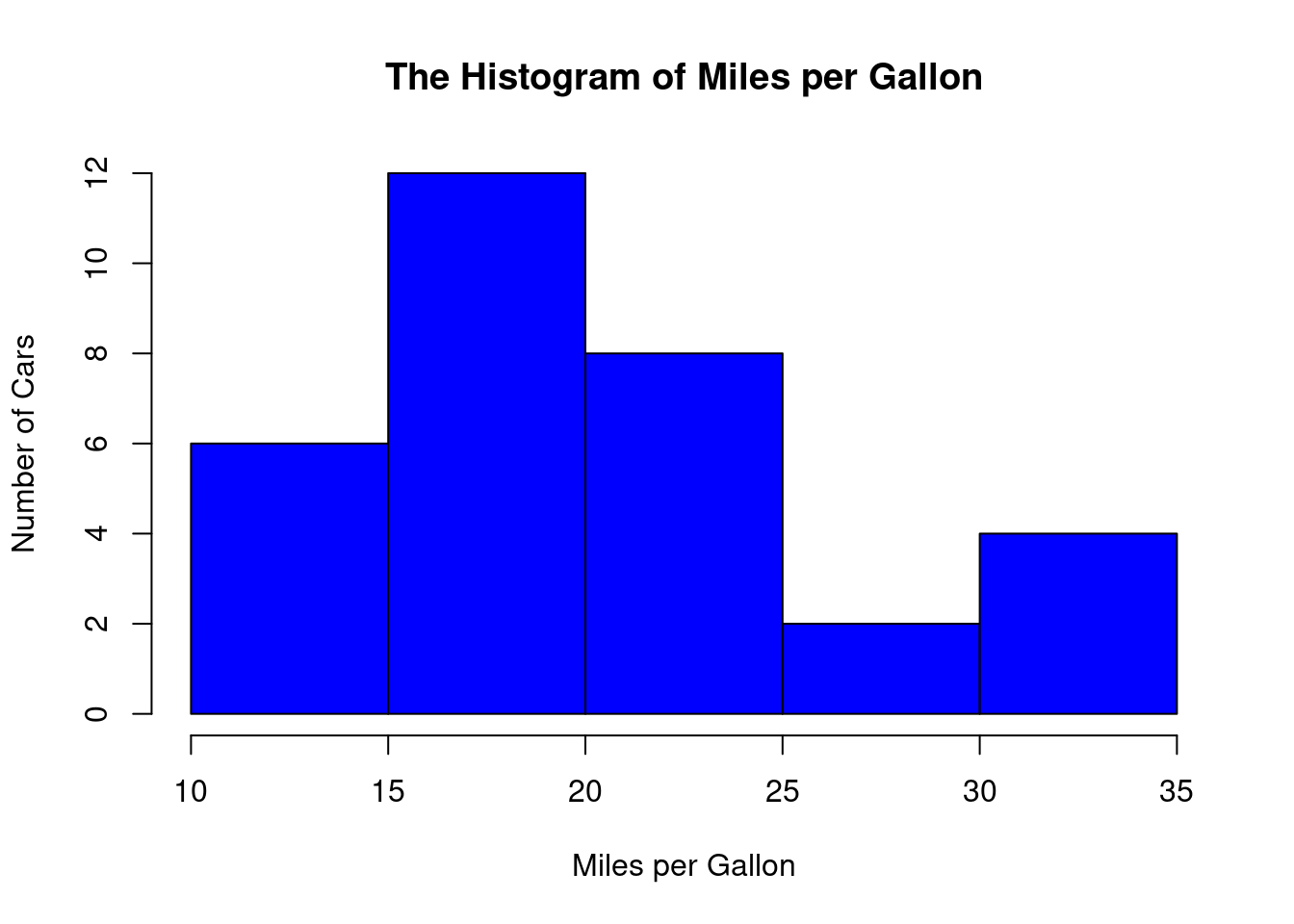
Explanation:
- hist is called a function in R, which is used to draw a histogram. A function in R (or in any programming language) is code already written and stored in the software. When calling a function, a pair of parentheses must be followed.
- The above code uses the $ sign to extract the values in the mpg column of the mtcars data.
- The breaks = 5 guides R to create 5 bins.
- The main = “The Histogram of Miles per Gallon” adds a meaningful title for the plot.
- xlab and ylab allows you to change names of axis titles.
- col = “blue” will change the color of the plot.
1.3.3 Making Boxplots Using R
We use the mpg (miles per gallon) in the R built-in “mtcars” data to make a boxplot.
boxplot(mtcars$mpg)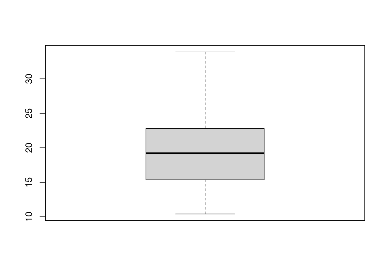
Explanation:
- The above code uses the function boxplot to make a boxplot.
1.3.4 Making Density Curves Using R
We use the mpg (miles per gallon) in the R built-in “mtcars” data to make a density curve.
hist(mtcars$mpg, freq = FALSE)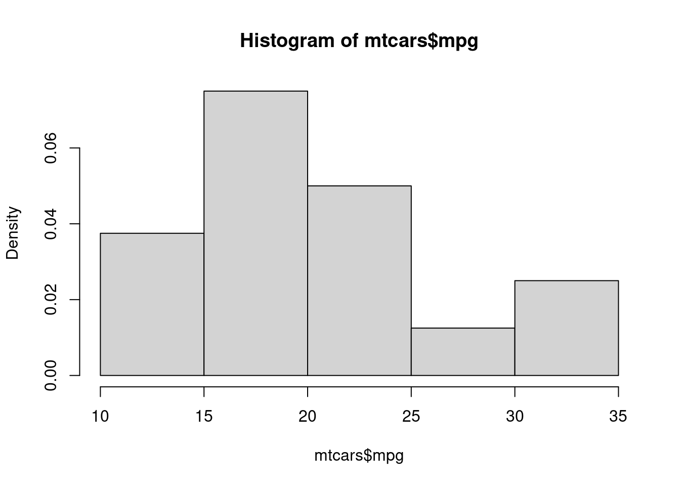
Explanation:
- The above code again uses the function hist to make a histogram, but it is different from what we made before.
- freq = FALSE allows you to change the y-axis (vertical) to a scale that is not frequency, but is called density. This new scale is obtained by dividing the original scale by the total number of values in the mpg column and then dividing by the width of each bin. Don’t let this to bother you if you don’t understand.
1.3.5 Making Bar Plots Using R
We use the values of the variable cyl (cylinder) in the R built-in “mtcars” data to make a bar plot.
# We must create a table to summarize how many cars
# have 4 cylinders, 6 cylinders, or 8 cylinders
cylinder_Table <- table(mtcars$cyl)

# We then plot the table
barplot(cylinder_Table, main = "The Bar Plot of Cylinder")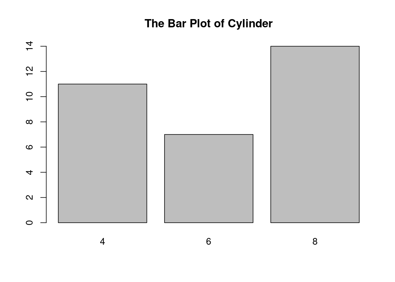
Explanation:
- The first line of code calls the table function to make a table. The table is then stored in cylinder_Table, which is called an R object. Many times, you need to store some intermediate results in R objects. The left arrow “<-” consists of the less-than sign (<) and the minus sign (-) on your keyboard. An R object can include an underscore sign (_) to make the object name meaningful.
- The function barplot is called to make the barplot.
1.4 Discribing the Relatioships between Two Quantitative Variables
A scatter plot is the most basic and widely used method for visualizing the relationship between two quantitative variables. Each point on the plot represents a single observation, with its x-coordinate representing the value of one variable and its y-coordinate representing the value of the other.
Strengths: Simple to understand and create, reveals patterns, clusters, and outliers. Useful for exploring both linear and non-linear relationships.
Weaknesses: Can become cluttered with large datasets, doesn’t directly show the strength or direction of the relationship.
Example 1: We plot wt vs. mpg using the mtcars data.
plot(wt ~ mpg,
     data = mtcars,
     main = "The Scatterplot of Miles per Gallon vs. Weight",
     xlab = "Miles per Gallon",
     ylab = "Weight",
     col = "red"
    )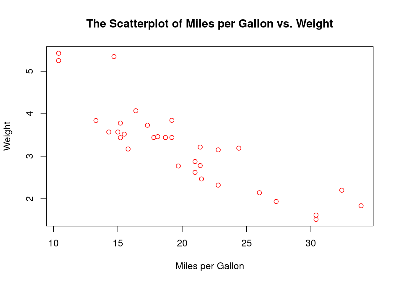
Interpretation:
- The plot shows that as the weight increases, the number of miles per gallon decreases.
A line graph is particularly useful when the quantitative variables represent a time series or a continuous sequence. The data points are connected by lines, showing trends over time or along the continuous variable.
Example 2: The sales for 20 consecutive days are given below:
120, 135, 150, 145, 160, 170, 165, 180, 190, 200, 195, 210, 220, 215, 230, 240, 235, 250, 260, 270
Create a line plot.
# Prepare data for visualization
sales = c(120, 135, 150, 145, 160, 170, 165, 180, 190, 200, 195, 210, 220, 215, 230, 240, 235, 250, 260, 270)

# Plot
plot(sales,
     type = "l",  # 'l' for line graph
     col = "blue",  # line color
     lwd = 2,  # line width
     main = "Sales Over 20 Days",  # title
     xlab = "Day",  # x-axis label
     ylab = "Sales ($)"  # y-axis label
)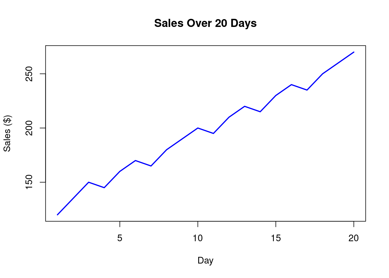
Interpretation:
- The line plot shows an increasing trend in sales.
Overfitting: When using a more complicated model for the situation where a simpler model is adequate, overfitting occurs. A model that overfits data performs well on the training data but fails to predict or classify accurately on new, unseen data, reducing its real-world usefulness.
1.5 The Correlation Coefficient: Measuring the Linear Relationship
The Correlation coefficient (or just correlation) is a statistical measure that describes the strength and direction of a linear relationship between two numeric variables. It ranges from -1 (perfect negative linear relationship) to 1 (perfect positive linear relationship), with 0 indicating no linear relationship.
Software such as R can easily calculate correlation for you.
Example 1: A class has 10 students. Their math scores are: 65, 72, 78, 80, 85, 88, 90, 92, 95, 98, and their English scores are: 55, 60, 62, 68, 70, 75, 78, 82, 85, 90. Calculate the correlation between the two scores.
# Prepare data
math = c(65, 72, 78, 80, 85, 88, 90, 92, 95, 98)
english = c(55, 60, 62, 68, 70, 75, 78, 82, 85, 90)

# Calculate correlation
cor(math, english)
[1] 0.979467Explanation:
- We created two R objects by calling the function c.
- We used the function cor to calculate correlation. Order doesn’t matter.
- The correlation (rounded to 2 decimal places by default) is 0.98, indicating a high positive linear relationship between math and English test scores.
If there is a linear relationship between two quantitative variables (\(y\) and \(x\)), we can use a straight line to model the relationship (or to fit the data). The equation of the line is called the regression equation, which can be expressed as
\[y=a+bx\]
Software can help find estimates for \(a\) (the intercept) and \(b\) (the slope). The methodology is called regression analysis.
Purpose of regression analysis:
- Predict the value of Y based on X (e.g., predict house prices based on size).
- Understand the relationship between X and Y (e.g., does more study time lead to higher test scores?).
Roles of Variables:
- Independent Variable (X): The variable we think causes or influences the outcome (e.g., hours studied).
- Dependent Variable (Y): The variable we want to predict or explain (e.g., test score). The relationship is represented by a straight line equation:
Example: If an regression equation is \(price = -6 + 0.0166\cdot size\), then the price (in 10 thousands) of a house of size (in square feet) 1900 would be \(-6+0.0166(1900)=25.54\), or $255400. The slope 0.0166 indicates each one square foot increase in house size increases the price by 0.0166(10000) or $166.
1.6 The \(Z\)-Score: A Tool to Standardizing Numeric Data
The \(Z\)-score, also known as the standard score, is a statistical tool used to standardize numeric data by expressing how many standard deviations a data point is from the mean of a dataset. This standardization process allows for the comparison of data points from different distributions or datasets that may have different scales or units. \(Z\)-scores are widely used in statistics, data analysis, and machine learning to identify outliers, normalize data, and make meaningful comparisons.
The \(Z\)-score for a data point (called \(x\)) in a dataset is calculated by subtracting the mean of data from \(x\) and then dividing the difference by the standard deviation of data.
A positive \(Z\)-score indicates the data point is above the mean, while a negative \(Z\)-score indicates it is below the mean. A \(Z\)-score of 0 means the data point is exactly at the mean.
Why Use \(Z\)-Scores?
- Standardization: Z-scores transform data into a common scale with a mean of 0 and a standard deviation of 1. This is particularly useful when comparing variables measured in different units (e.g., height in centimeters vs. weight in kilograms).
- Outlier Detection: Z-scores help identify outliers. Typically, a data point with a Z-score greater than 3 or less than -3 is considered an outlier, as it lies far from the mean.
- Comparability: Z-scores enable comparisons across different datasets or distributions by placing data on the same relative scale.
- Data Normalization for Analysis: Many statistical methods and machine learning algorithms assume or perform better with standardized data, making Z-scores a critical preprocessing step.
Example 1: Suppose you have a dataset of test scores: 70, 80, 85, 90, 95.
Calculate the mean of the data.
Calculate the variance of the data.
Calculate the standard deviation of the data.
Calculate the \(Z\)-score of each test score.
Interpret the first \(Z\)-score.
Solution:
Calculate the mean of the data: \[(70+80+85+90+95)/5=84.\]
Calculate the variance of the data:
\[\frac{(70-84)^2+(80-84)^2+(85-84)^2+(90-84)^2+(95-84)^2}{5-1}=92.50\] c) Calculate the standard deviation of the data: \[\sqrt{92.50}=9.62\]
- Calculate the \(Z\)-score of each test score:
- The \(Z\)-score for 70: \((70-84)/9.62=-1.46\)
- The \(Z\)-scores for other 4 values are \(-0.42, 0.10, 0.62, 1.14\), respectively.
- The \(Z\)-score of 70 is \(-1.46\), indicating that this score is 1.46 standard deviation below the class mean score.
1.7 Exercises
Calculating Measures of Central Tendency: A small bakery recorded the number of croissants sold each day for 10 consecutive days: 25, 22, 28, 22, 24, 26, 29, 22, 23, 23. Calculate the mean, median, mode, variance, and standard deviation of croissant sales. Which measure best represents the typical daily sales, and why?
A real estate agent recorded the sale prices (in thousands of dollars) of seven houses she sold last month: 250, 220, 280, 240, 260, 290, 1200.
Calculate the mean, median, and mode of the house sale prices.
Are there any outliers? Justify your answer using an appropriate method (e.g., the 1.5*IQR rule, visual inspection of a box plot).
Which measure of central tendency (mean, median, or mode) best represents the typical sale price for this agent, and why? How does the presence of any outliers affect your choice? Would you report the mean, median, or another statistic in order to best represent the data to potential clients? Explain your decision.
- A researcher measured the concentration of a particular pollutant (in ppm) in seven water samples from a lake: 1.2, 1.5, 1.3, 1.4, 1.6, 1.8, 10.0.
Calculate the mean, median, and mode of the pollutant concentrations.
Discuss whether there is an outlier present and justify your claim with at least one method (e.g., visual inspection, IQR rule).
Considering the environmental implications, which measure of central tendency is most informative when describing pollutant levels to policymakers? Explain how the presence of an outlier impacts the interpretation and recommendations based on the data. Would different summary statistics (e.g., a trimmed mean) be more suitable in this context? Explain your answer.
- A factory recorded the number of defective items produced in seven batches: 5, 7, 6, 8, 4, 9, 50.
Compute the mean, median, and mode for the number of defective items.
Does the data suggest the existence of any outliers? Explain how you identified the outlier(s), if any.
For quality control purposes, which measure of central tendency is most useful in this situation? Explain your reasoning. How does the presence of an outlier(s) affect this choice? What other aspects of the data are relevant to quality control beyond just the central tendency (e.g., variation or distribution shape)?
- (Interpreting a Frequency Distribution) The following table shows the ages of participants in a yoga class:
| Age Range | Frequency |
|---|---|
| 20-29 | 5 |
| 30-39 | 12 |
| 40-49 | 8 |
| 50-59 | 3 |
| 60+ | 2 |
- What is the total number of participants?
- Which age range has the highest frequency?
- Describe the overall distribution of ages (e.g., is it skewed? Is it centered around a particular age range?).
- The following data represents the daily high temperatures (in °F) for a city over a week: 72, 75, 78, 80, 76, 79, 74.
Calculate the range, variance, and standard deviation of the daily high temperatures.
Interpret the meaning of the standard deviation in the context of the data. What does it tell you about the variability of the daily high temperatures?
- You are given the following five-number summary for the exam scores of two classes:
Class A: 70, 72, 75, 78, 80, 82, 85, 88, 92, 100 Class B: 55, 65, 70, 72, 73, 75, 75, 78, 80, 85, 90, 95
- Fill in values in the following table.
| Statistic | Class A | Class B |
|---|---|---|
| Minimum | ||
| Q1 | ||
| Median | ||
| Q3 | ||
| Maximum |
- Draw a box plot for each class. Overlay the two boxplots. Compare the distributions of exam scores for the two classes. Which class performed better overall according to the median, and how do their scores vary?
- For each of the following data:
A: 20, 22, 23, 24, 25, 25, 26, 26, 27, 27, 28, 28, 28, 29, 29, 30, 30, 30, 30, 31, 31, 31, 32, 32, 32, 33, 33, 33, 34, 34, 34, 35, 35, 35, 36, 36, 37, 37, 38, 38, 39, 39, 40, 40, 41, 41, 42, 42, 43, 43 B: 10, 12, 15, 18, 20, 22, 23, 24, 25, 26, 27, 28, 29, 30, 31, 32, 33, 34, 35, 36, 37, 38, 39, 40, 41, 42, 43, 44, 45, 46, 47, 48, 49, 50, 52, 55, 60, 65, 70, 75, 80, 85, 90, 100, 110, 120, 150, 200
C: -200, -150, -120, -100, -90, -80, -75, -70, -65, -60, -50, -45, -42, -40, -38, -37, -35, -33, -32, -30, -28, -27, -25, -24, -23, -22, -20, -18, -15, -12, -10, 10, 12, 15, 18, 20, 22, 23, 24, 25, 26, 27, 28, 29, 30, 31, 32, 33, 34, 35
Create a histogram with 6 bins.
Calculate mean and median.
Which of the following is true based on the above analysis?
- The symmetrical dataset has a mean, median, and mode that are approximately equal.
- The positively skewed dataset has a mean significantly larger than the median and mode.
- The negatively skewed dataset has a mean significantly smaller than the median and mode.
A student scored 85 on a math test with a mean of 75 and a standard deviation of 10. What is the student’s z-score? What does this z-score tell you about the student’s performance relative to the class?
A student has taken tests in two subjects, Math and English, with scores recorded for a class of students. The tests have different scoring scales and variability. We want to compare the student’s performance in both subjects to determine in which subject they performed relatively better compared to their peers. The following are the data:
- Math scores for the class (out of 100): 65, 72, 78, 80, 85, 88, 90, 92, 95, 98
- Student’s Math score: 85
- English scores for the class (out of 100): 55, 60, 62, 68, 70, 75, 78, 82, 85, 90
- Student’s English score: 78
1.8 Case Study: Customer Satisfaction Survey Analysis
The data is given below:
| Age | Gender | Purchase Amount ($) | Product Category | Satisfaction (1-5) |
|---|---|---|---|---|
| 28 | Female | 120.50 | Clothing | 4 |
| 35 | Male | 89.99 | Electronics | 3 |
| 42 | Female | 210.00 | Home | 5 |
| 23 | Other | 55.75 | Beauty | 2 |
| 50 | Male | 150.25 | Electronics | 4 |
| 31 | Female | 95.00 | Clothing | 5 |
| 45 | Male | 180.50 | Home | 4 |
| 29 | Female | 70.25 | Beauty | 3 |
| 38 | Other | 130.75 | Clothing | 4 |
| 52 | Male | 200.00 | Electronics | 5 |
1.8.1 A Sample Report
A report can be created that includes the following sections: (Check if the numbers and statements in this report are correct)
Introduction
This case study examines customer feedback data from a retail company’s satisfaction survey. The goal is to understand customer demographics, purchasing behavior, and satisfaction levels to identify areas for business improvement.
Data Characteristics
The dataset contains 10 customer responses with the following key variables:
Age (18-65 years)
Purchase amount (10−500)
Gender (Male, Female, Other)
Product category (Electronics, Apparel, Home Goods, Beauty)
Satisfaction rating (1-5 scale: 1=Very Dissatisfied to 5=Very Satisfied)
Key Findings
Customer Spending Patterns
The average purchase amount was 85,with most customers spending between $50 and $120.
15% of customers made purchases over $200, representing the high-value customer segment.
Older customers (45+) spent 30% more on average than younger customers (under 30).
Product Category Preferences
Apparel was the most popular category (42% of purchases)
Electronics had the highest average order value ($112)
Beauty products had the highest percentage of repeat purchases
Satisfaction Levels
Overall satisfaction averaged 4.1/5
Electronics had the highest satisfaction (4.3)
Home Goods had the lowest satisfaction (3.7)
Customers spending over $100 rated satisfaction 0.5 points higher on average
Notable Trends
Age-Spending Relationship:
Spending increased steadily with age
Peak spending occurred in the 50-55 age group
Gender Differences:
Female customers comprised 65% of apparel purchases
Male customers dominated electronics purchases (70%)
Satisfaction Drivers:
Fast shipping correlated most strongly with high ratings
Product quality was the second strongest satisfaction factor
Price was the least correlated with satisfaction scores
Business Recommendations
Targeted Marketing:
Develop premium product bundles for customers over 45
Create gender-specific promotions (apparel for women, electronics for men)
Satisfaction Improvements:
Address quality concerns in Home Goods category
Highlight fast shipping in marketing materials
Implement loyalty program for beauty product customers
Operational Changes:
Increase inventory of high-satisfaction products
Train staff on product knowledge for lower-rated categories
Consider free shipping thresholds to encourage larger purchases
1.8 Conclusion
The analysis reveals significant opportunities to enhance customer experience and increase revenue. By focusing on high-value customer segments, improving problem categories, and leveraging satisfaction drivers, the company can strengthen its market position. The strongest opportunities appear to be in catering to older customers and improving the Home Goods shopping experience.
Future research could examine satisfaction differences between first-time and repeat customers, as well as the impact of seasonal trends on purchasing behavior.