Create new project → Choose “Quarto” → Click “OK”.
Posit Cloud Interface (4 Panes):
Upper-Left: Source code editor (Quarto Document).
Lower-Left: Console for direct commands.
Upper-Right: Minimize (not used here).
Lower-Right: Files and project directory.
We’ll use built-in dataset mtcars for examples.
Slide 11: Exploring mtcars Dataset
Dataset Overview: Data on 32 cars.
Variables: Miles per gallon (mpg), horsepower (hp), weight (wt), transmission (am: 0=auto, 1=manual).
Basic Commands:
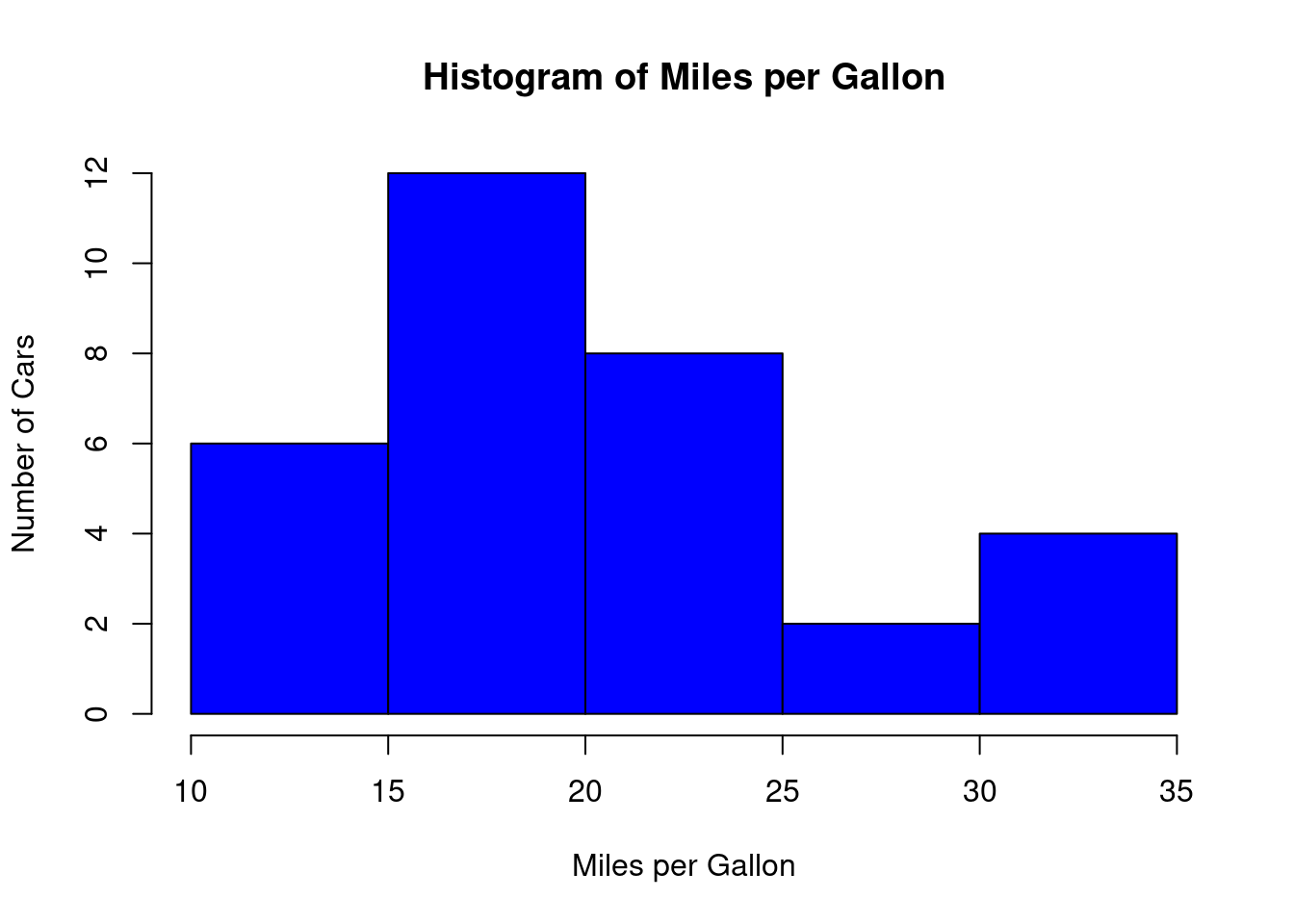
Slide 12: Making Histograms in R (1.3.1)
Example: Histogram of mpg from mtcars.
hist( mtcars$mpg, breaks =5, main ="Histogram of Miles per Gallon",xlab ="Miles per Gallon",ylab ="Number of Cars",col ="blue")
Explanation:
hist(): Function for histograms.
breaks=5: Number of bins.
main, xlab, ylab: Title and x-, y-Labels.
col=“blue”: Bar color.
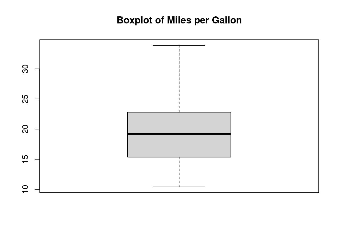
Slide 13: Making Boxplots in R (1.3.2)
Example: Boxplot of mpg from mtcars.
boxplot(mtcars$mpg, main ="Boxplot of Miles per Gallon")
Explanation:
boxplot(): Function for creating boxplots.
Shows five-number summary and outliers.
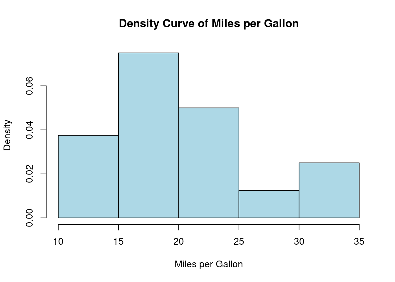
Slide 14: Making Density Curves in R (1.3.3)
Example: Density curve for mpg from mtcars.
hist(mtcars$mpg, freq =FALSE, main ="Density Curve of Miles per Gallon", xlab ="Miles per Gallon", ylab ="Density", col ="lightblue")
Explanation:
hist() with freq=FALSE: Converts frequency to density scale.
Y-axis represents density (area under curve = 1).
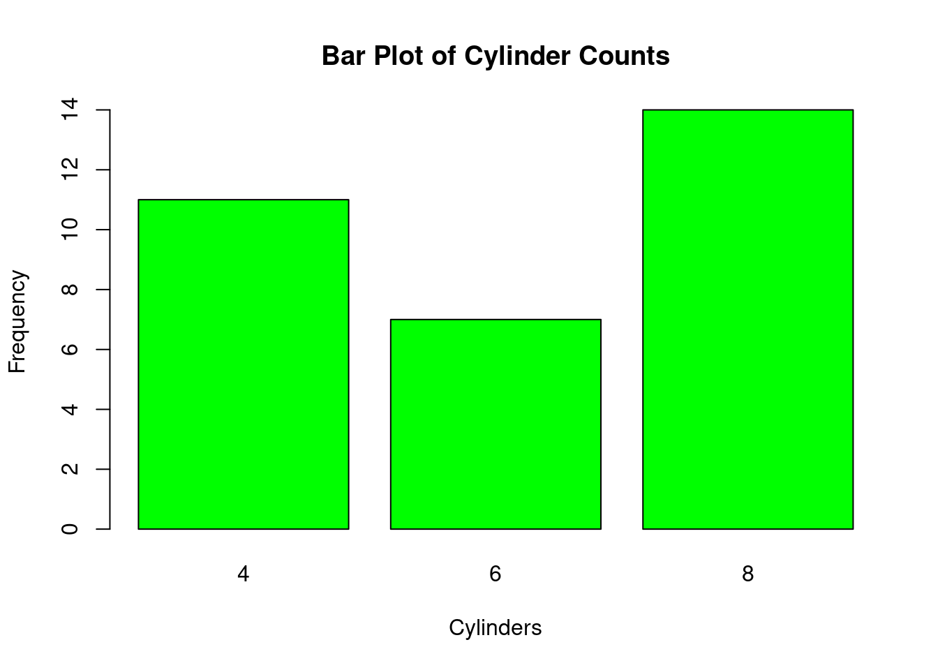
Slide 15: Making Barplots in R (1.3.4)
Example: Barplot of cylinder counts in mtcars.
cylinder_table <-table(mtcars$cyl)barplot(cylinder_table, main ="Bar Plot of Cylinder Counts", xlab ="Cylinders", ylab ="Frequency", col ="green")
Explanation:
table(): Summarizes counts per category.
barplot(): Creates the bar plot with labels and color.
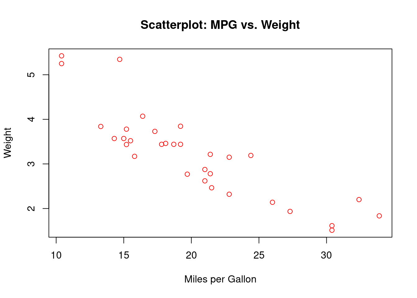
Slide 16: Scatter Plots for Quantitative Variables (1.4)
Definition: Visualizes relationship between two numeric variables. Strengths: Reveals patterns, clusters, outliers. Weaknesses: Can be cluttered with large data. Example: Weight (wt) vs. Miles per Gallon (mpg) from mtcars.
plot(wt ~ mpg, data = mtcars, main ="Scatterplot: MPG vs. Weight", xlab ="Miles per Gallon", ylab ="Weight", col ="red")
Interpretation:
As weight increases, MPG decreases.
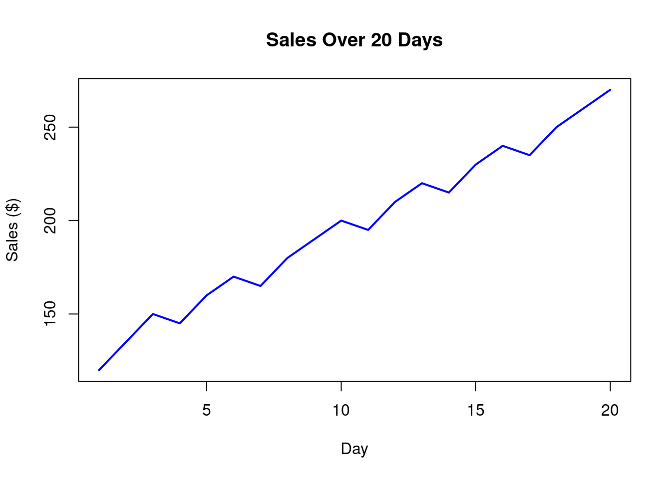
Slide 17: Line Graphs for Trends (1.4)
Use: Best for time series or continuous sequences. Example: Sales over 20 days.
sales <-c(120, 135, 150, 145, 160, 170, 165, 180, 190, 200, 195, 210, 220, 215, 230, 240, 235, 250, 260, 270)plot(sales, type ="l", col ="blue", lwd =2, main ="Sales Over 20 Days", xlab ="Day", ylab ="Sales ($)")
Interpretation:
Shows an increasing trend in sales.
Slide 18: Correlation Coefficient (1.5)
Definition: Measures strength and direction of linear relationship (-1 to 1). Example: Math vs. English scores for 10 students.
Correlation of 0.98 indicates strong positive relationship.
Slide 19: Z-Score for Standardization (1.6)
Definition: Measures how many standard deviations a data point is from the mean. Formula: \[z = \frac{x-\bar{x}}{s}\] where \(\bar{x}\) = mean, \(s\) = standard deviation. Uses:
Standardize data (mean=0, sd=1).
Detect outliers (\(|z| > 3\)).
Compare across datasets. Example: Test scores (70, 80, 85, 90, 95). Mean = 84, SD ≈ 9.62. Z-score for 70: \((70−84)/9.62=−1.46\) (1.46 SDs below mean).
Slide 20: Selected Exercises (1.7)
Exercise 1: Calculate mean, median, mode, variance, SD for croissant sales (25, 22, 28, etc.). Exercise 9: Z-score for math test (Score=85, Mean=75, SD=10). What does it mean? Exercise 10: Compare student performance (Math=85, English=78) using Z-scores across class data.
Slide 21: Case Study - Customer Satisfaction (1.8)
Data Overview: Survey of 10 customers (Age, Gender, Purchase Amount, etc.). Key Findings:
Avg. purchase: 130.
Satisfaction: Avg. 4.1/5.
Recommendations:
Target older customers (>45) with premium bundles.
Improve Home Goods quality.
Future Research: Analyze seasonal trends, repeat vs. first-time customers.
Slide 22: Conclusion Summary:
Learned measures of central tendency & dispersion, visualization techniques, and relationships.
Practiced R for histograms, boxplots, barplots, and more.
Explored Z-scores and correlation.
Next Steps: Apply these concepts to real datasets, complete exercises, and deepen R skills.